Top positive review
6 people found this helpful
Comparison between the Dell 32 and the LG 32
By Katie Washington on Reviewed in the United States on September 23, 2019
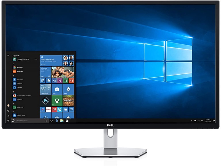
Comparison between the Dell S Series Led-Lit Monitor 32" Black (S3219D) and the LG 32MP58HQ-P 32-Inch IPS Monitor with Screen Split I wanted a 32 inch monitor because I have been unable to find a reliable and affordable way to have two external monitors with my laptop, and I need the ability to see two pdfs in portrait mode, full page, side by side. Both monitors will do that adequately. The difference is that the LG has a more limited resolution than the Dell, and this is an absolute deal-breaker for me. I ordered the LG first. Set up was a breeze. However, once I got inside programs and apps that I need to do my job, the limit on resolution really bothered me. A monitor this large really should be able to go to 2560 x 1440 (and maybe above). Resolution of 1920 x 1080 just makes it look like you’re someone who can’t see without the computer version of a page magnifier. I searched on amazon again and found the Dell and wondered if it would be worth the hassle of packing the LG back up, returning it, and reconfiguring my desk for the Dell. Oh how glad I am that I took the chance. The Dell is twice as much monitor for about the same price. The increased resolution does what I need it to do, and it feels like it is a more substantial monitor that will last years. Below are the comparisons between the two. They aren’t necessarily pros or cons, because that will depend on your own preferences and what you intend to use the monitor for. Like I said, the deal-breaker for me was resolution, but maybe you don’t care about resolution. Use this comparison to inform your decision. The LG is light, and an unexpected bonus is that it sits lower, which I did not like at first as 32 inches is a pretty wide swath of desk to not be able to place stapler, tape dispenser, glasses case, etc. under. After using it a few days, I appreciated that it visually cut off the cord/cable clutter behind the monitor and made for a more pleasant view. The Dell monitor is SO. MUCH. HEAVIER. This makes unpacking and setup a bit difficult, but also makes me think it is better built. Who knows. The Dell also sits higher which can be good or bad. I have several things set up under it, but it also means the top of the screen is higher than the LG, which you may or may not like. The LG “split screen” software is buggy, so buggy. Almost unusable, and half the time wouldn’t boot correctly. I have not found that I really needed it with the Dell. I just resize the windows and position them beside each other. The LG does not come with an HDMI cable, the Dell does. The LG’s plug is large, which means it blocks other plugs in your power strip. The Dell has the same kind of plug most electrical machines/appliances have. That’s it. YMMV.
Top critical review
5 people found this helpful
Read this if you are hooking this up to an iMac
By bionicman97 on Reviewed in the United States on May 14, 2019
So this is a tough one for me. I have not decided if I will keep it or not. First off a few things: 1). If you are going to hook this up to an iMac, buy a 6 foot mini display port to display port cable. I bought the three foot cable and it was about 2 inches to short to but this monitor on the left side of my iMac. So I decided to use an HDMI cable until I got get a six foot mini DP to DP cable in. That lasted all of 15 minutes. Which brings me to point #2 2). Do not use an HDMI cable. I did not have the issue that others had mentioned about not being able to get full native resolution. That came up no problem. However, as soon as I hooked up the HDMI cable I could see another problem. The colors were horrible. I played with the various color spaces and couldn’t get anything that worked. So I got out my ColorMunki and did a full calibration. It was ok, but still just really couldn’t stand the colors. This is when I first learned about the issue with the YPbPr Color format. If you hook up this monitor to an iMac with an HDMI cable, it defaults to this format. You can override it and change it to RGB, but it immediately looks horrific. There is a workaround you can do through terminal and recovery mode, but I really didn’t want to go to that much trouble for a monitor I wasn’t even sure I was going to keep. So I rearranged my iMac and the Monitor (which takes longer than you think when you have neatly bundled the cables for 9 different peripherals) just so I could try it out with the mini DP to DP cable. Which leads me to the next point. 3). The color format defaults to RGB as soon as you hook it up with a mini DP to DP cable and looked much much better. It still on the lower end of what I consider acceptable, but it was acceptable and drastically better than using the HDMI (to the point I wouldn’t even consider using an HDMI cable on this monitor). I recalibrated with the ColorMunki and again saw another improvement. The ColorMunki really had to dim down the monitor to get the white balance right, but it did get it right. I manually increased the brightness (The monitor does not get overly bright in my opinion on full blast) to what I could consider acceptable, which threw off the color balance slightly, but it’s still acceptable. So having done all this the color was finally useable. Which brings me to the next point. 4). I’m not sure what other people are seeing or if I’m just extremely picky, but I definitely would not use the word “sharp” to describe text on this monitor and definitely wouldn’t add the words “tack” or “razor” in front of it. Before this setup i used two additional 27” monitors that were both 1920x1080. I considered the text on them fuzzy and on the very low end of tolerable, but I did all my main work on the iMac and used the other two monitors to keep my email, iMessage, and our company management software open, so I lived with it. Switching over to this monitor from those, I would consider this marginally better. It’s not as fuzzy as the 27” monitors, but it is just fuzzy enough that I find it annoying. It’s like looking at a photo that is just slightly out of focus. You keep asking yourself “is that in focus” and you zoom in and nope, it’s not. That’s the best way I can describe it. I think I’m going to be able to tolerate it, but I’m not 100% sure yet. I have to wonder what the text would look like with a 4K monitor hooked up to this. I played around with zooming in an out and it felt like using command+ to increase the font one time in Chrome made it a little better. Same with iMessage. So what’s the verdict? I’m honestly not sure. The price is great. It looks well built. I’m not impressed with the brightness. You definitely need to use the display port if you’re hooking up to an iMac. And then finally you have to decide how important sharp text is for you. I’m still on the fence over the last point.
Sort by:
Filter by:
By -
Verified Amazon Purchase
Vine Customer Review of Free Product
Sorry, no reviews match your current selections.
Try clearing or changing some filters.Show all reviews
Show more reviews